Thirteen research backed form design principles that lift completion and satisfaction. Clear tips to make forms fast, simple, and error resistant.

Forms play a significant role in user interactions since it is usually through this feature that users can access a given service, make purchases, or gather other relevant and vital information.
A good layout simplifies these interactions, increases customer satisfaction, reduces mistakes, and improves the total rate of completed forms. This is especially critical in mobile-first environments, with limited screen space and attention spans.
As people are more concerned with computer networks, form designing should be an essential focus. Studies conducted in this field have helped determine and articulate better ways of doing user-centered forms.
To make your web design better and neater, read this guide.
Contrast
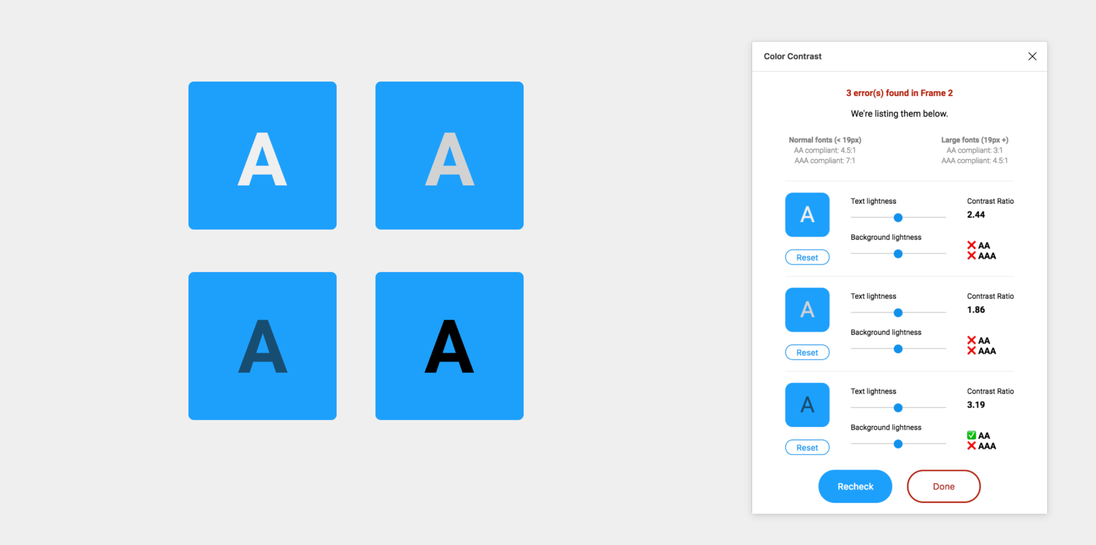
Contrast separates important elements from everything else on your form. It uses color, size, and typography to guide users toward the most critical actions.
High contrast draws immediate attention to submit buttons and required fields. When your call-to-action button stands out from the background, users know exactly where to click next.
Proper contrast also ensures your form text remains readable. Dark text on white backgrounds or white text on dark backgrounds creates the clearest reading experience. This approach follows WCAG 2.1 accessibility standards, which require a minimum contrast ratio of 4.5:1 between text and background colors.
Four Types of Contrast
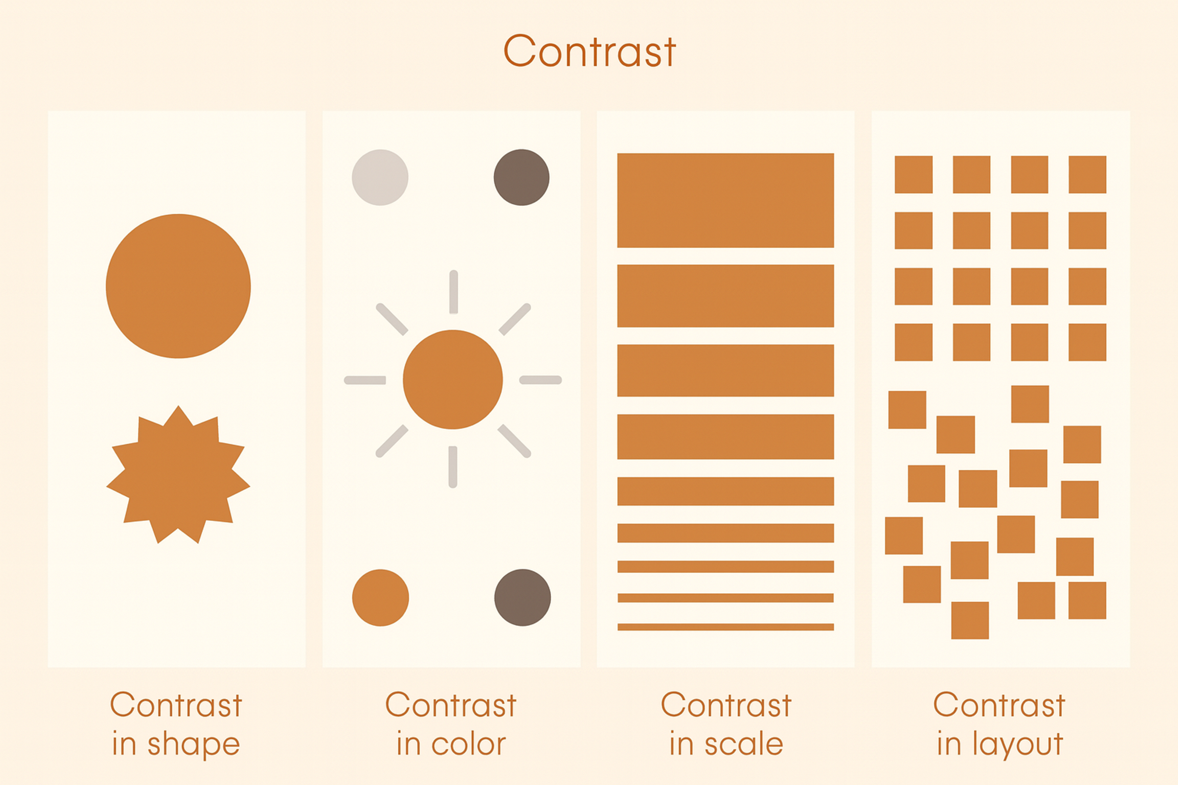
Spotify does this well: bright green buttons on dark backgrounds make subscription actions impossible to miss, so users instantly know where to look.
Contrast can also create balance around a central focal point—useful for rating systems or circular layouts.
And contrast isn’t only color: size, font weight, and spacing can separate elements and guide users through a form.
Single-Column Layout
Single-column layouts improve form completion rates by creating a natural reading flow. Users scan from top to bottom without having to jump between columns or miss important fields.
This layout matches how people naturally read and scroll through content. When fields appear in a predictable vertical sequence, users can fill them out in one smooth motion without refocusing their eyes across the page.
Typeform’s single-column, conversational forms reduce abandonment by keeping a clear, natural flow.
Keep the layout single-column by default, with rare side-by-side exceptions for closely related fields (e.g., first/last name, city/state). This is especially important on mobile, where multi-column layouts break usability.
Source: websitesetup
Unity
When we speak about unity in form design, we mean the work pocketing all available constituents to give the user a perfect and complete feeling. This concept is essential in composing every element of the form: its colors, typefaces, fields to fill in, buttons, and even the spaces in between. Unity is closely tied to the principle of harmony, where disparate elements like typography and iconography share visual traits (e.g., rounded corners and consistent stroke widths).
A clear design language keeps attention on content, not mismatched styles. Use consistent colors and components to guide actions and build your brand. For example, Dropbox uses its signature blue for primary buttons across forms.
That consistency creates recall and makes the flow easier to follow. Unified design feels dependable and professional, which builds user trust. Trust leads to smoother interactions and a better overall experience.
Our project for Grayscale demonstrates how unity in design plays a vital role in creating a cohesive digital identity. Every element, from colors and typography to spacing and buttons, is harmonized to give users a seamless experience.
Grayscale Web Design by Clay
By maintaining consistency across all design aspects, the site directs user focus toward content rather than conflicting styles. This approach strengthens the brand’s identity and enhances user trust and engagement, offering a polished and professional interaction.
This approach goes beyond Grayscale. At Clay, we craft immersive, user-focused experiences for the crypto space, blending innovative design with seamless functionality.
By aligning brand identity with user needs, we help businesses build trust, create lasting impressions, and foster meaningful connections with their audience.
Pattern
Design patterns are familiar elements users see across sites and apps. They cut the learning curve and speed up forms. When your form follows known patterns, people don’t have to think. They use what they already know.
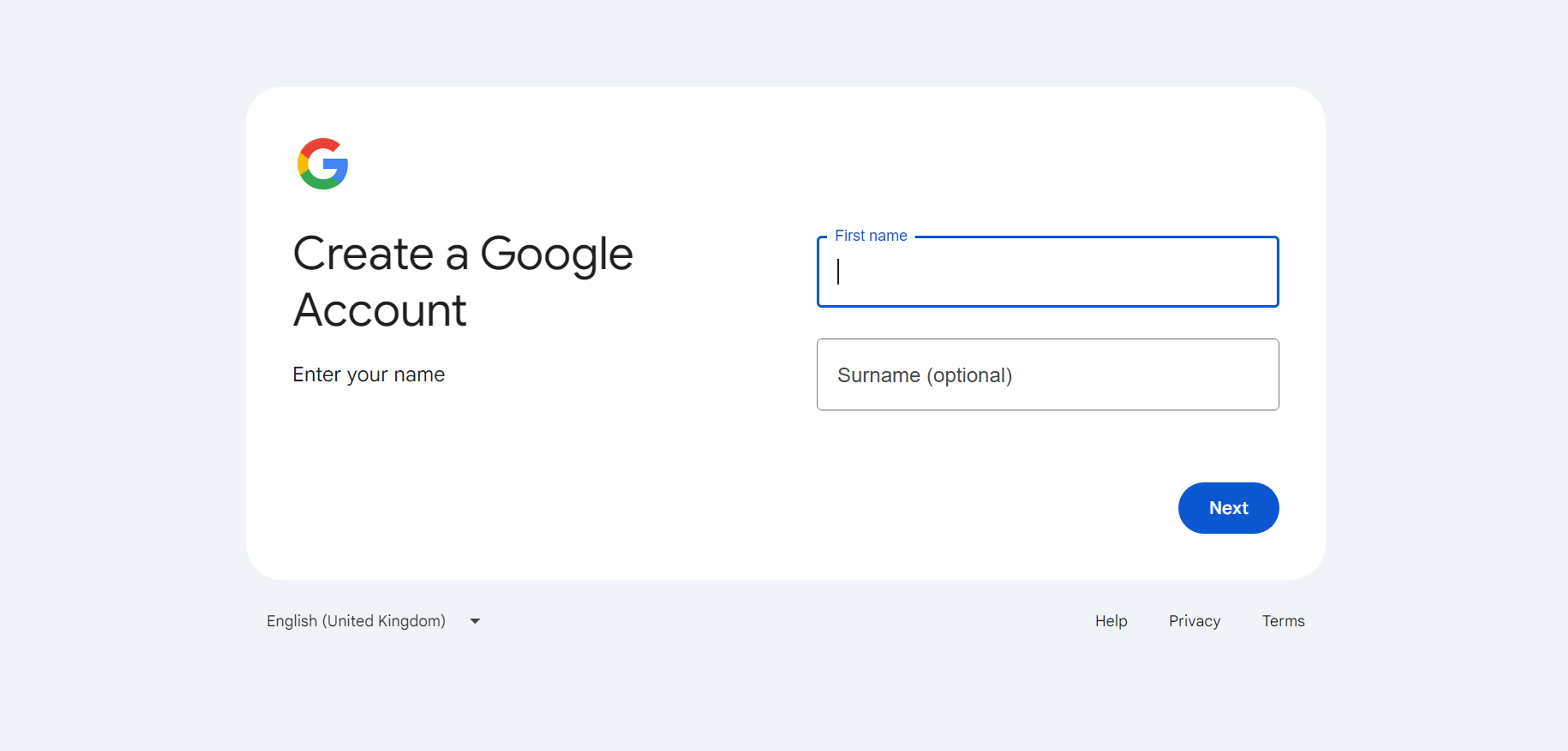
Conventions make forms intuitive. Required fields use red asterisks. Email comes before password. The submit button sits at the bottom. Google’s sign-up follows these rules with clear validation and predictable buttons. Amazon’s checkout uses the standard order: shipping first, then payment. This predictability reduces friction.
Break patterns only with a strong reason and solid testing. Most of the time, consistency serves users better than clever twists. Give instant, clear error messages and show how to fix issues. Meeting these expectations keeps the experience smooth.
Source: accounts.google
Clear and Concise Labels
Clear labels remove confusion about each field. Make them precise, descriptive, and easy to see while typing.
Placement matters. Labels above inputs are usually clearest. Left-aligned labels save space but increase mental effort.
Do not rely on placeholders as labels. They vanish when users type and leave no guidance.
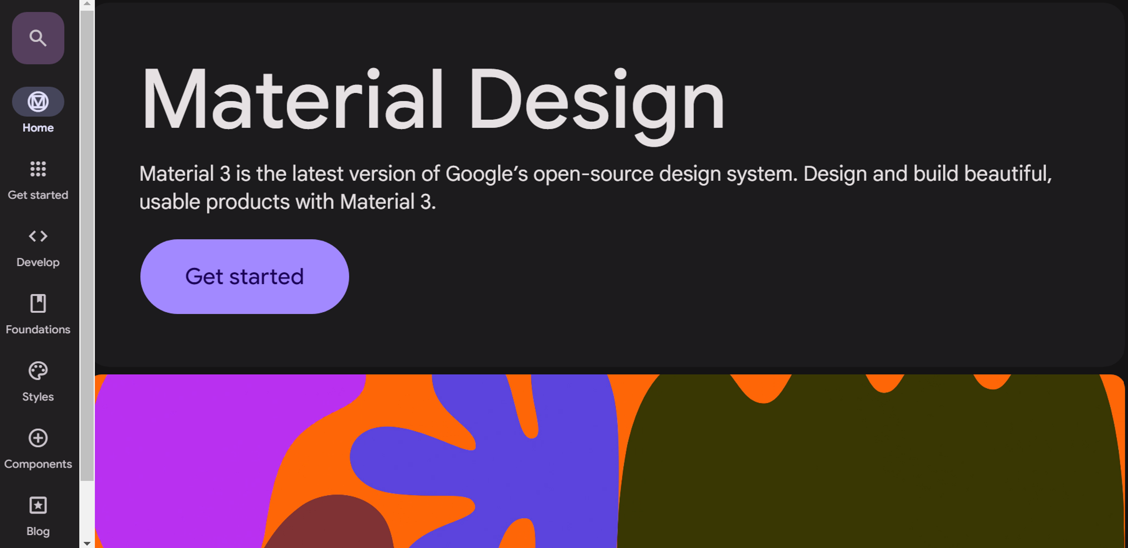
Material Design shows good practice. It uses clear labels above fields and supportive placeholder text.
Keep labels concise but specific. “Email” is better than “Contact information.”
Match language to your audience. Avoid jargon for general users.
Test labels with real people to confirm understanding.
Add short help text when extra guidance improves accuracy.
Source: m3.material.io
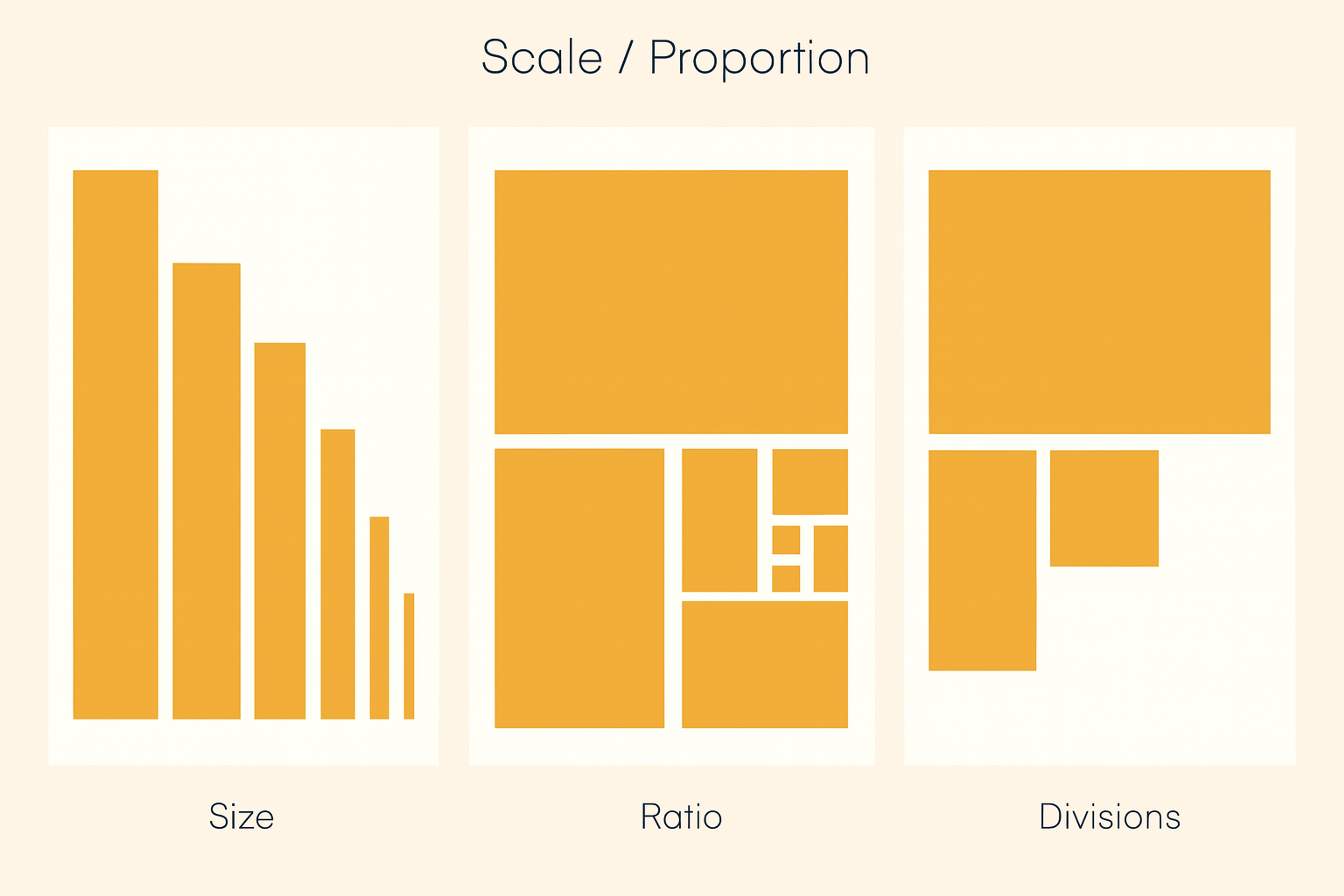
Scale and Visual Weight
Scale creates hierarchy. Bigger elements signal importance; smaller ones feel secondary.
Make the submit button larger than “Cancel” or “Reset.” Guide users to complete the form.
Use larger, bolder headers for sections and key instructions. They orient users in long forms.
Give primary actions the most visual weight. Keep secondary actions lighter. Use distinct colors for destructive actions.
Maintain proportional balance so nothing feels oversized or too tiny.
On mobile, size for touch. Buttons and fields should be easy to tap. Aim for at least 44×44 pixels.
Scale / Proportion of Size, Ratio, Divisions
Appropriate Input Types
HTML5 input types boost accuracy and ease of use. They match each field to the right control.
Use email to auto-check format and open the email keyboard on phones. Use tel to show a numeric keypad. Use date to give a calendar picker and avoid format mistakes. Users no longer guess between MM/DD/YYYY and DD/MM/YYYY.
number fields can set min and max values. That stops invalid entries and keeps data clean. Quantity pickers follow your business rules.
Choosing the right input type is vital on mobile. It triggers the correct keyboard and speeds completion.
Add progressive enhancement. Offer modern inputs where supported and clean fallbacks where they are not. This keeps forms usable for everyone while improving them for most users.
Balance
Visual balance spreads elements so no area feels too heavy or too light. Balanced forms feel stable and intentional.
Symmetrical balance arranges items evenly around a center line. It looks formal and organized. It suits simple forms where order matters.
Asymmetrical balance mixes sizes and weights without losing stability. Careful placement keeps the layout dynamic and clear.
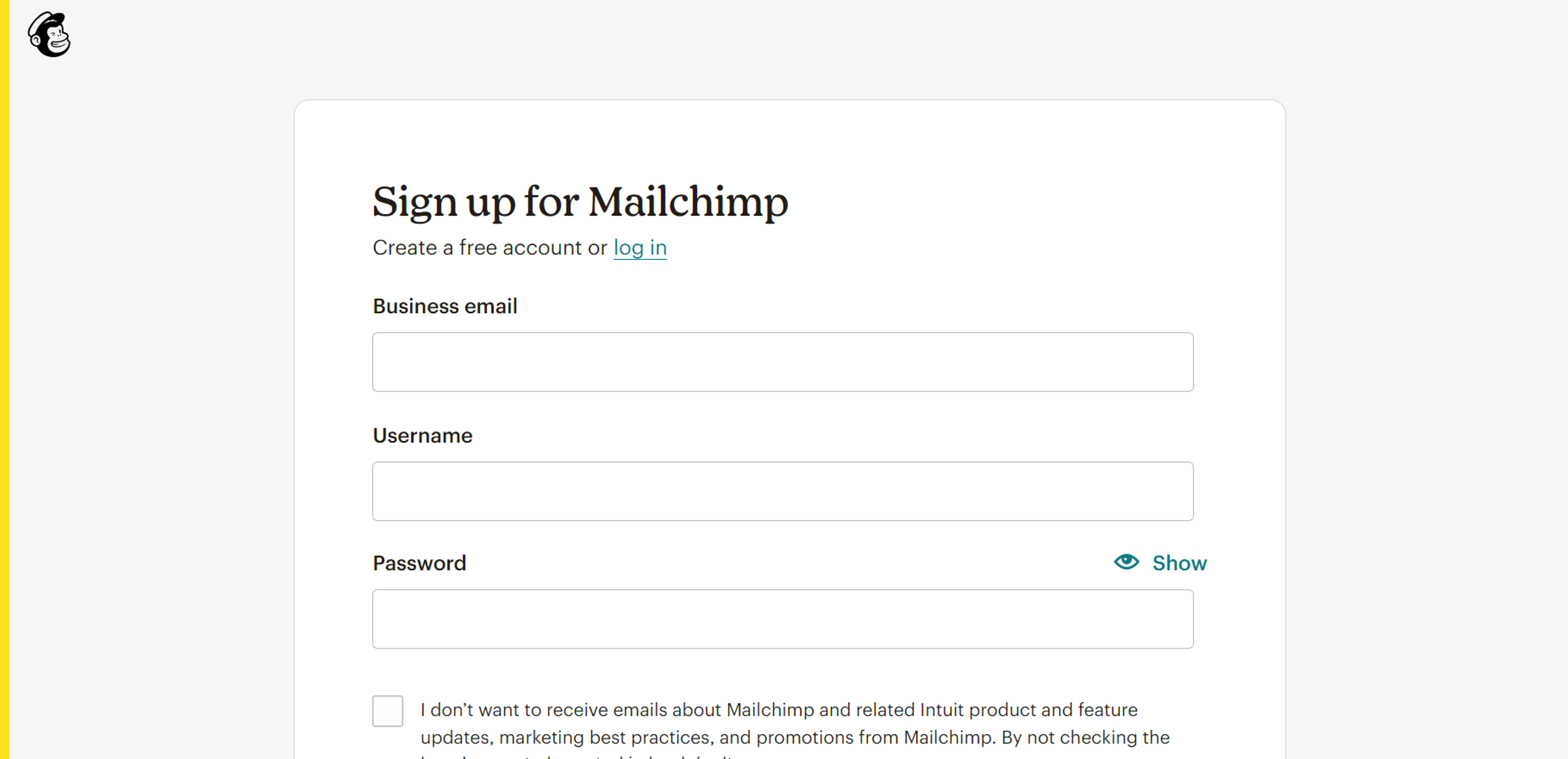
Mailchimp’s sign-up forms show good balance. They feel professional without looking stiff.
White space is crucial. Space between fields prevents crowding and lowers mental load.
Watch visual weight. Dark colors, big sizes, and bold type feel heavier. Distribute them thoughtfully across the form.
Source: login.mailchimp
Variety
Variety keeps users engaged in long forms. Mix input types – multiple choice, sliders, text fields, and dropdowns – to fit each question and add interest.
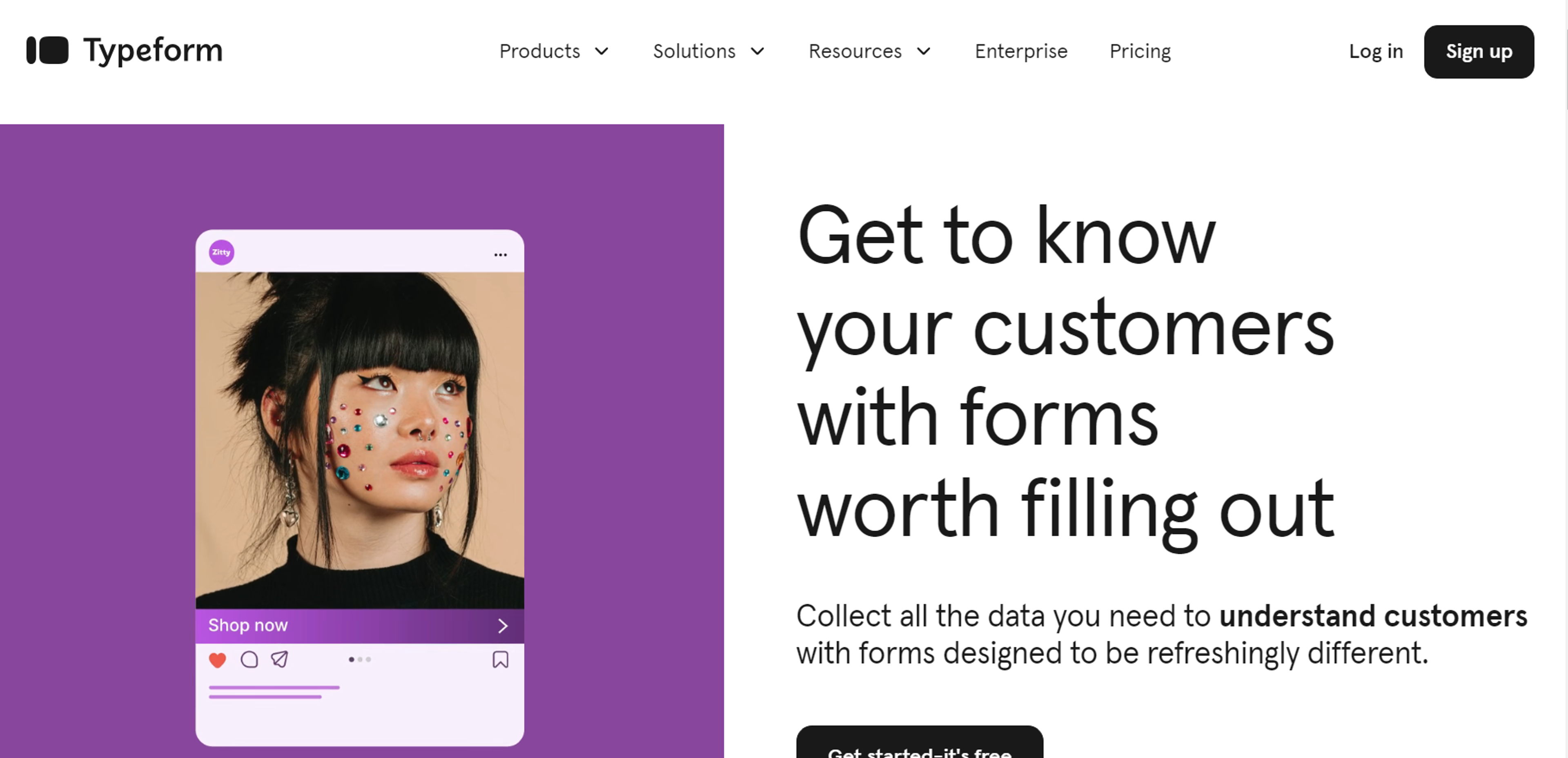
Use subtle changes in color and type to mark sections without causing chaos. Typeform shows this well: diverse inputs and light interactivity make forms feel like a conversation.
Add conditional fields to personalize the flow based on answers. Make sure every variation serves a purpose and aids completion.
Stay consistent. Even with different inputs and visuals, keep one design language so the form feels unified and professional.
Source: typeform
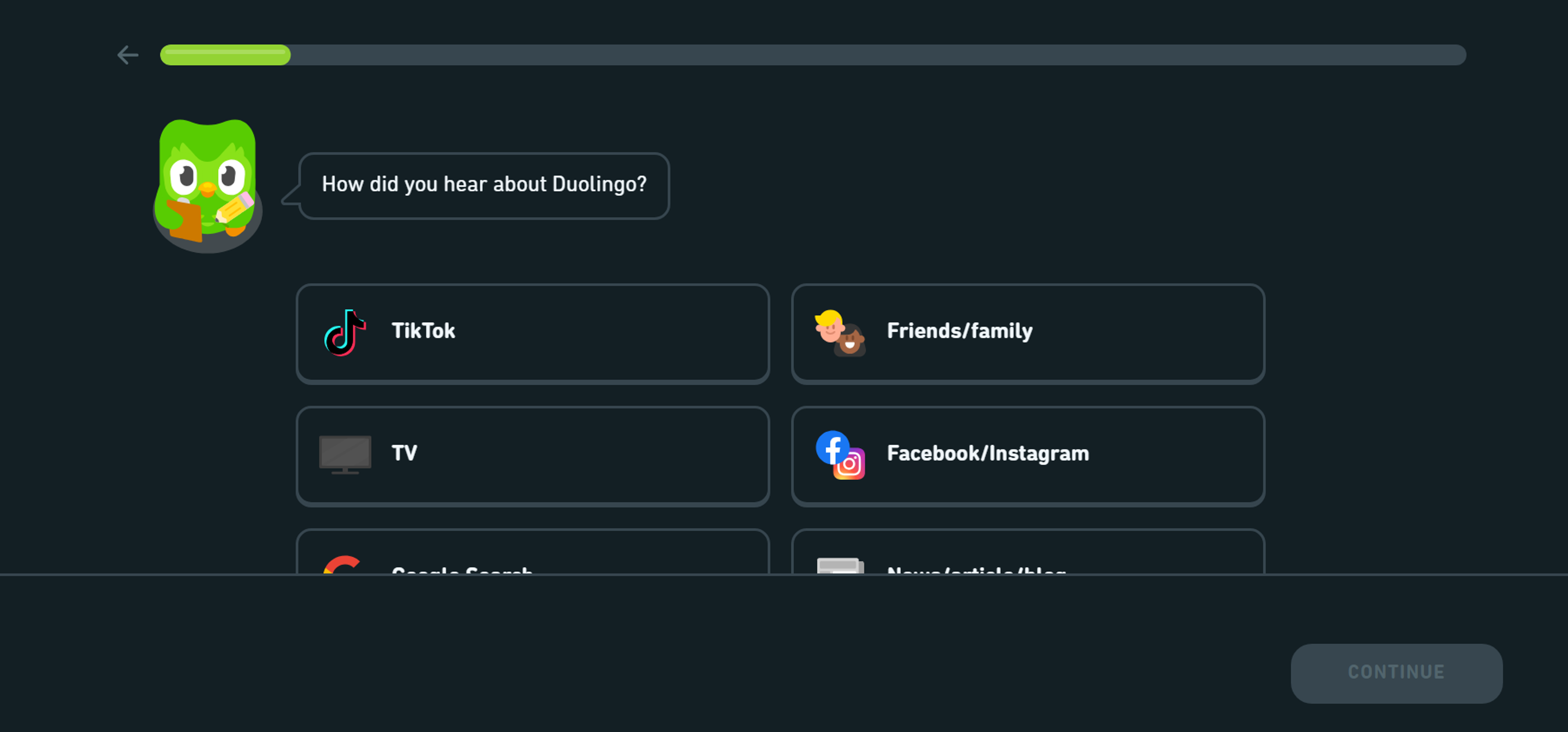
Optimize Form Length
Short forms usually convert better. Ask only what you truly need. If a form is long, split it into clear steps. Show progress so users know how far they’ve come.
Reveal extra questions only when they’re relevant. This keeps the first view short and focused. Duolingo’s onboarding does this well by using quick, simple steps.
Prioritize must-have questions and collect nice-to-have details later. Mark optional fields clearly and place them after required ones. For lengthy flows, let users save and finish later.
Source: duolingo
Rhythm
Rhythm guides users through a form with predictable spacing, alignment, and order. Consistent field heights and gaps create a natural flow. People learn where the next field will appear and how to move forward.
Group related fields with equal spacing, like contact info or billing and shipping. Keep button placement, label positions, and help text consistent so users don’t think about the interface. Use larger gaps to mark new sections and smaller gaps to link related fields.
Maintain the same rhythm on mobile and tablet. Adapt spacing to the screen while keeping the logical flow intact.
Consider the form design on LinkedIn’s sign-up page. The consistent spacing, alignment, and logical sequence of input fields create a smooth flow for users. This rhythm ensures a simple and intuitive experience, keeping users engaged throughout the process.
Source: linkedin
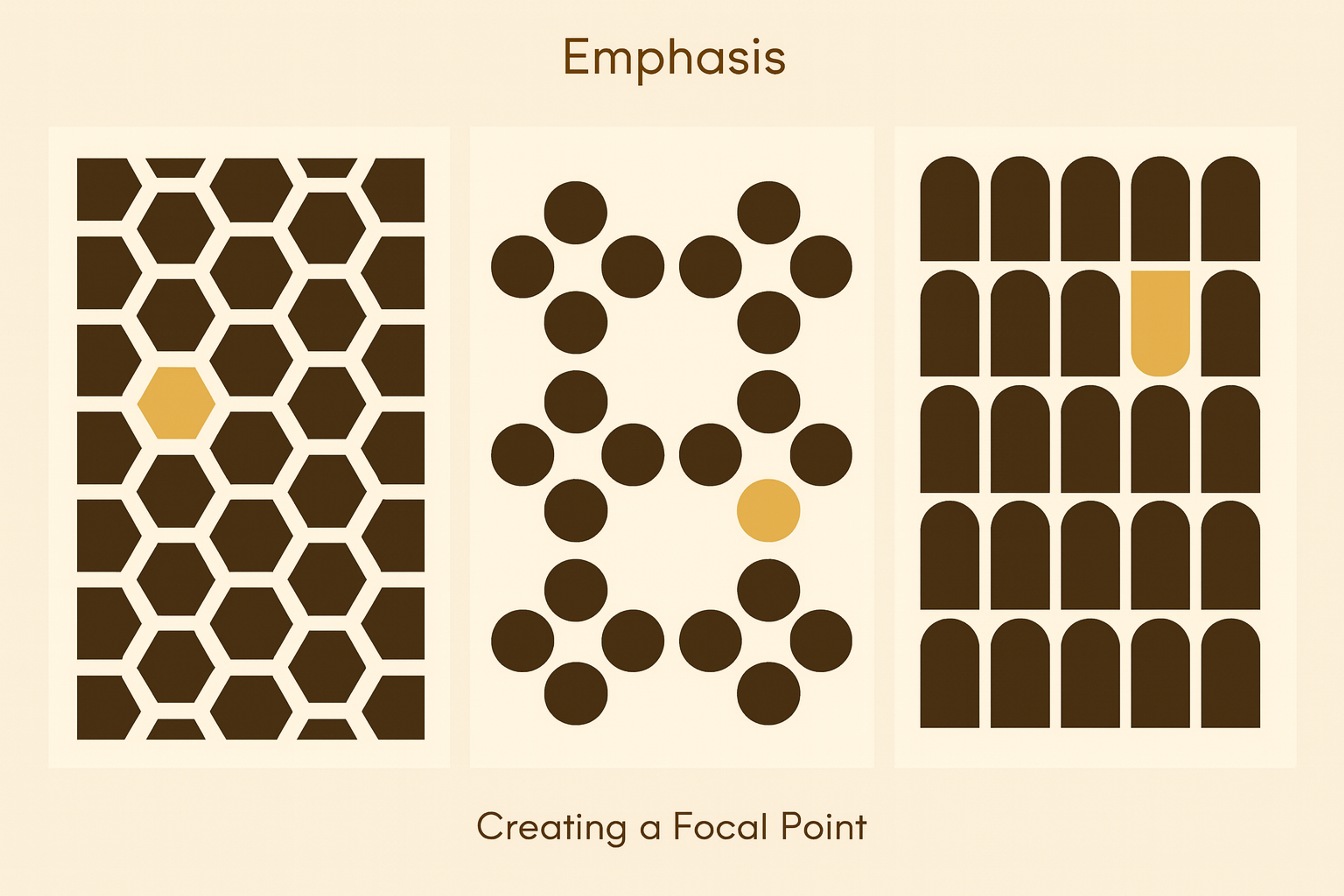
Emphasis
Emphasis guides attention to the most important form elements. Use color, size, position, and type to signal priority.
Give the primary action button the strongest emphasis. Make it larger, bolder, or in a high-contrast color. It should clearly show the next step.
Color works well for critical actions and key notes. Contrast makes submit buttons pop and highlights required fields or instructions.
Typography can also lead the eye. Use bold or larger text for important directions and error messages so no one misses them.
Position matters. Place crucial elements at the top or beside key fields. Show the right information at the right moment.
Don’t overdo it. Too many highlights create noise. Pick one main emphasis method per section to keep things clear.
Emphasis by Creating Focal Points
Offer Field Focus
Field focus makes the active input stand out. Users see exactly where they are typing.
Show focus with a border color change, a light highlight, or a subtle animation. Keep it clear but not distracting. Color is fast to read – many forms switch a gray border to blue or add a soft glow.
On mobile, focus cues matter even more. There’s no hover, and tapping can be imprecise. Clear indicators confirm the right field before typing.
Keep the focus state visible while users type. This steady signal prevents errors and builds confidence.
Make focus accessible. Keyboard and assistive tech users rely on strong indicators. Use gentle animations to smooth the change without hurting clarity.
FAQ
What Is Form in Principles of Art?
Form in art refers to objects with three dimensions – height, width, and depth. It goes beyond shape by adding volume and mass, giving artworks a sense of realism.
What Defines a Form in Art?
A form is defined by its structure and how it occupies space. Light, shadow, and perspective help define its volume.
What Is a Form Example?
Examples include spheres, cubes, cylinders, and pyramids in sculpture or painting. In drawing, shading a circle into a sphere shows form.
What Defines Form?
Form is defined as the three-dimensional quality of an object, distinguished from flat shapes by depth and volume.
Read more:
- Website Header Design: Creating a Stunning First Impression
- How to Develop a Winning Web Content Strategy in 2026
- Tips & Best Practices for Mastering Backgrounds in Web Design
Conclusion
Effective form design reduces user effort through smart choices, combining balance and clear emphasis to improve completion.
Keep testing and iterating based on feedback so forms stay usable as needs evolve.